In today’s crowded market, a great product isn’t enough. Brands need a soul, an identity that truly connects. At The Kika (our creative agency), we know rebranding is more than just a fresh coat of paint it’s about redefining a brand’s narrative. We recently partnered with Sanjeevani Cold Pressed Oils, a brand built on purity, wellness, and tradition, to give their story a visually compelling new chapter.
This is the optimized, story-driven blog content, focusing on the keywords and making the narrative interactive and easily understandable.
Chapter 1: The Identity That Needed to Grow
Sanjeevani’s foundation is unmatched: natural goodness, 100% purity, and the promise of healthier living through their cold-pressed oils.
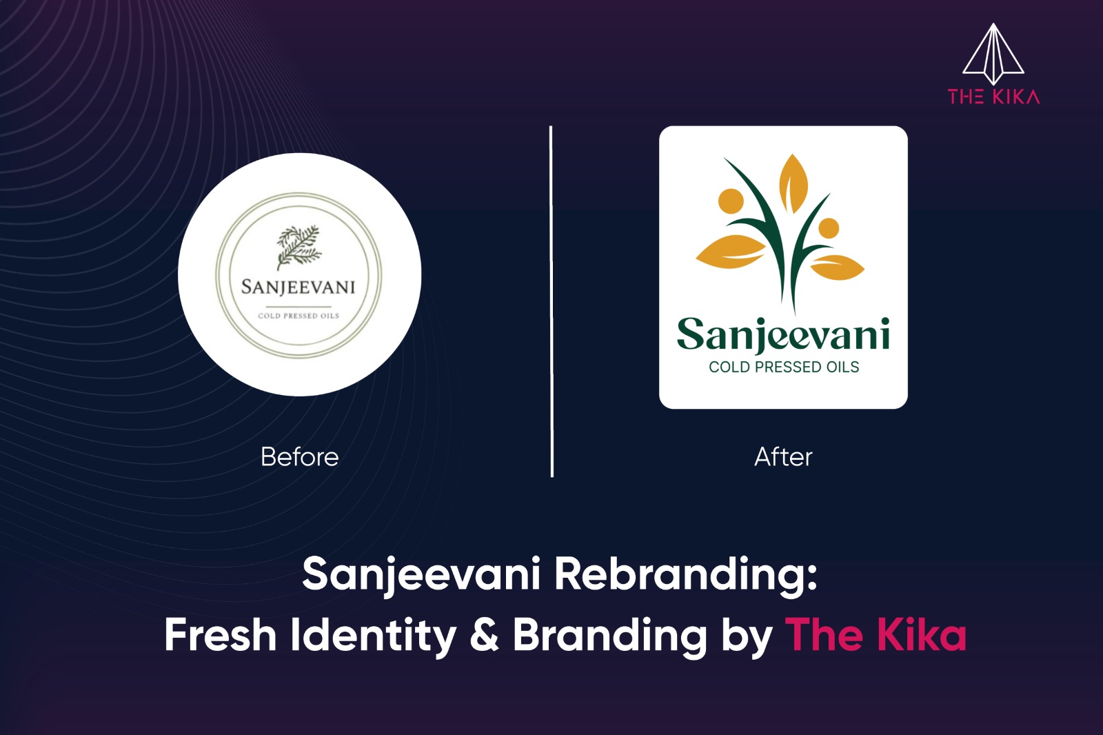
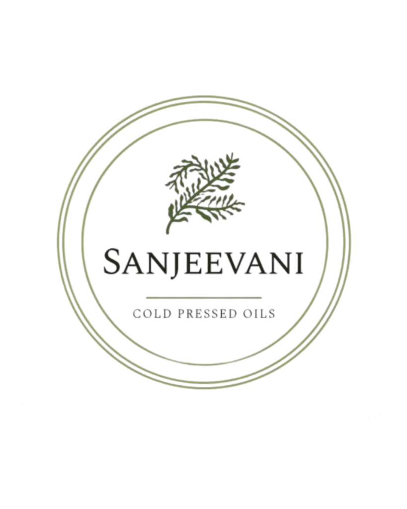
The Starting Point: Take a look at their original label (like the one you might see below on an old jar). The design was honest, a bit rustic, and whispered their message: “Purity is our Promise.”
The challenge? In the modern aisle, that whisper was getting lost. The design was traditional, lacking the minimal, clean aesthetic that today’s wellness-conscious consumer instantly seeks. We saw a discrepancy: a timeless, pure product (like their amazing A1 Grade Groundnut Oil) was packaged in an identity that felt a little… dated.
We had a clear mission: execute a full-scale rebranding that would make Sanjeevani look as vital and pure as their oils taste. The identity needed to be minimal, clean, and instantly relatable.
Chapter 2: The Kika’s Creative Agency Journey
Our process began not with sketching, but with listening. We dove deep into Sanjeevani’s story the tradition of Lakdi Ghani extraction and the power of their ingredients. We wanted their identity to stand strong in both traditional and modern contexts.
Our core goal was to evolve the visual language from “traditional” to “timeless.” We explored concepts rooted in: Growth, Purity, and Trust.
Chapter 3: The New Logo Where Purity Finds its Voice
The ultimate result of our creative thinking is the new logo. It’s a visual summary of Sanjeevani’s promise.
We moved away from the reserved, twig-like motif of the past and created something that radiates energy:
- The Minimal Leaf Motif: This stylized emblem, with its dark green stems and vibrant, golden-yellow leaves/orbs, symbolizes freshness, growth, and natural purity. It’s a simple, universal symbol of life and vitality, speaking instantly to the concept of cold-pressed oils.
- The Typography: Notice the font. The word “Sanjeevani” is set in an elegant, strong vogun & poppin font. This wasn’t accidental; it represents the brand’s credibility and authenticity the heritage of the name. It sits above “COLD PRESSED OILS” in a clean, modern type, grounding the product in today’s market.
Together, these elements build a logo that doesn’t just look refined; it communicates the brand’s core promise bringing the essence of nature into every home.
This is the optimized, story-driven blog content, focusing on the keywords and making the narrative interactive and easily understandable.
Chapter 4: The Impact of a Great Branding Strategy
The rebranding effort extended far beyond the logo. It touched every consumer interaction:
- Bold, Clean Packaging: We created designs that finally matched the product’s quality, giving Sanjeevani commanding presence on the shelf.
- A New Voice: We helped introduce “Daddi,” a quirky mascot, to connect the wisdom of tradition with a warm, modern personality.
- Digital Transformation: We developed a new website and comprehensive digital strategy to ensure the brand’s pure message was consistent everywhere.
For us at The Kika, this was a labor of passion. The Sanjeevani rebranding journey has set the tone for their next chapter of growth, and we are proud to have partnered with them on this transformation.

Bringing the Brand to Life at Exhibitions
Our collaboration with Sanjeevani Cold Pressed Oils went beyond the rebranding process. At their exhibitions, The Kika designed and developed all creative banners and posters that reflected the brand’s refreshed identity. With clean layouts, nature-inspired visuals, and impactful messaging, the exhibition space became a true extension of Sanjeevani’s story. The designs not only captured attention but also reinforced the brand’s core values of purity, wellness, and trust, creating a memorable experience for visitors.
Closing Note
For us at The Kika, this project was more than just a design exercise it was about telling Sanjeevani’s story visually. The rebranding journey has set the tone for their next chapter of growth, and we’re proud to have been a part of it.
At The Kika, we specialize in creating powerful brand stories through design, strategy, and innovation. Here’s where you can explore more:
Explore Sanjeevani Cold Pressed Oils and their new identity
Discover our branding and design services
View the complete Sanjeevani Cold Pressed Oils brand identity project on Behance